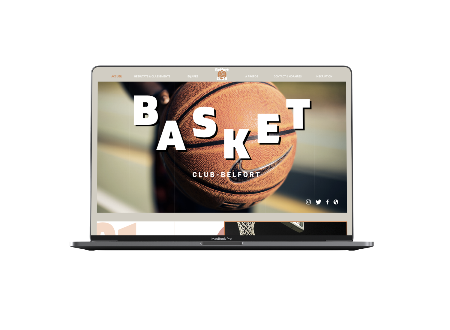
There are 5 steps for this redesign of a basketball website : moodboards, wireframing, design system, graphical interface models and prototypes
During my 4th semester in MMI, I had to choose an option and I chose Webdesign. For me, it was obvious to choose this option because I want to let my passion become my profession in my nearest years. So I learned how to create a great design according to an Ux Design process. The UX design owns a big part of the project because isn't only a simple detail, it's a conscious consideration which is thought from the beginning,
The first step of this redesign was to create a moodboard I chose colors that remind basketball like a bright orange and complementary colors (dark blue) in order to create a contrast for a better readability. My moodboard is an assemblage of basketball's images, objects and words to express the style that I chose for the development of my creative idea :
1
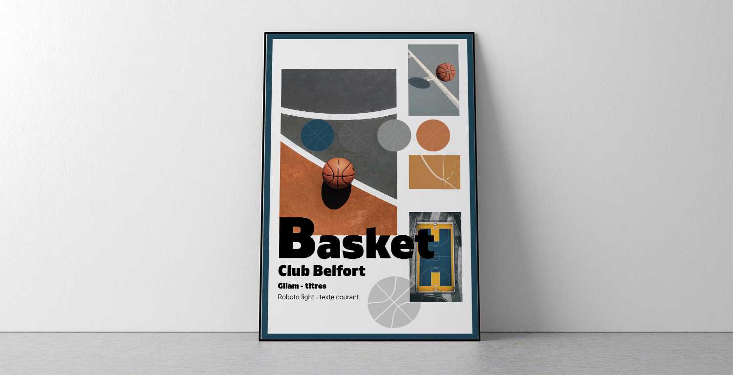
HEXA #e56e31
RGB R : 229
V : 110
B : 49
HEXA #174c61
RGB R : 23
V : 76
B : 97
HEXA #616161
RGB R : 97
V : 97
B : 97
HEXA #949997
RGB R : 148
V : 153
B : 151
2
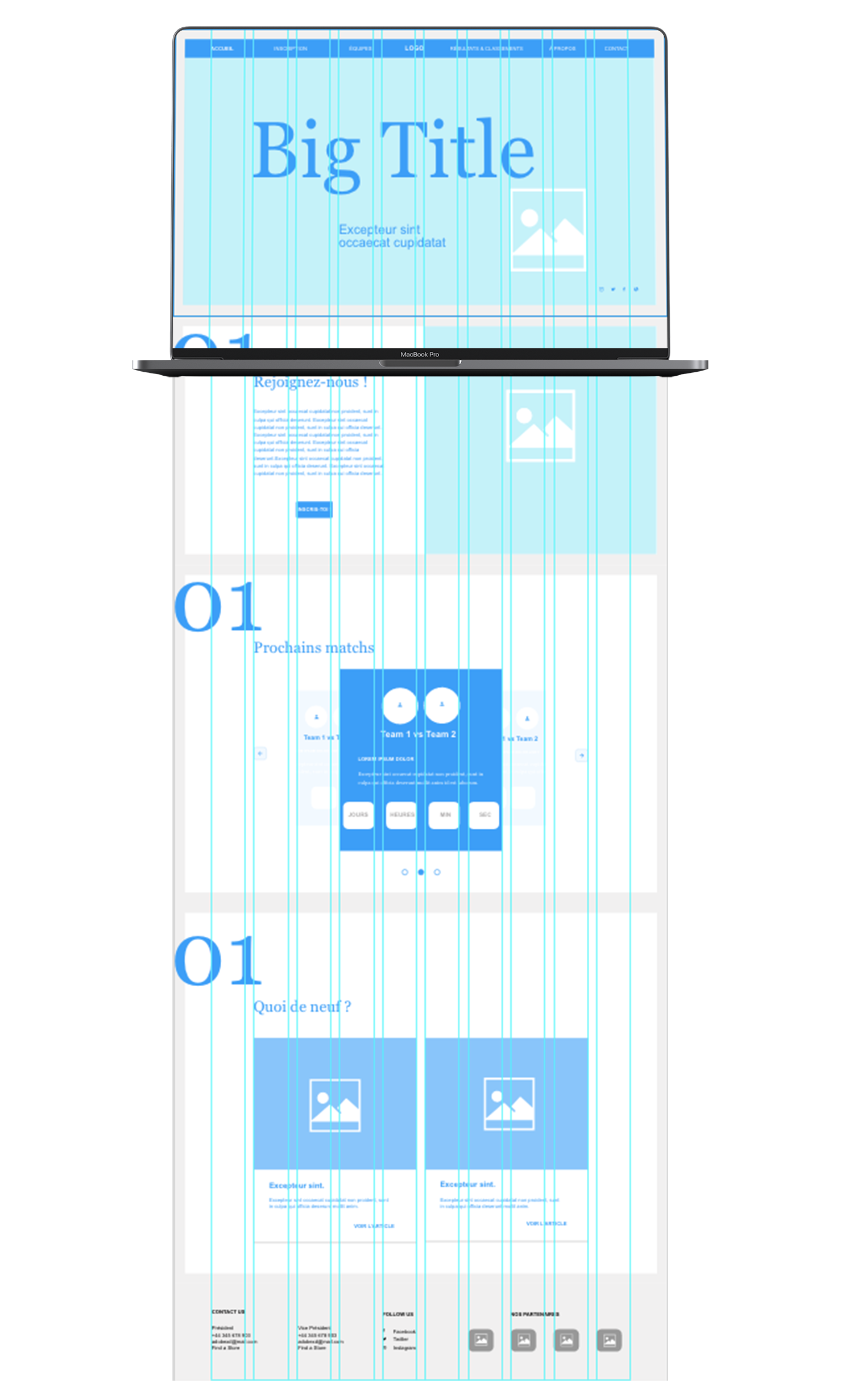
Then, I created a wireframe. Here, it was a skeleton of low fidelity which was presented with a neutral graphic eliminating the elements of distraction to make it clear and understandable. The aim of my wireframe was only to facilitate my work afterwards for the creation of my graphical interface model.
3

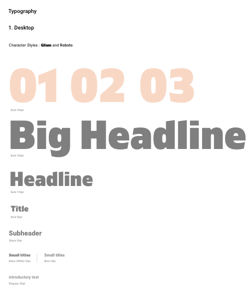
After that I've made the wireframe, I created the design system. It's the direct descendant of the graphic charter, it tends to integrate into the teams' workflow in order to reconcile the print with the digital. So I've made my atoms and with them my moleculs, then my organisms, my templates and finally my pages.
4
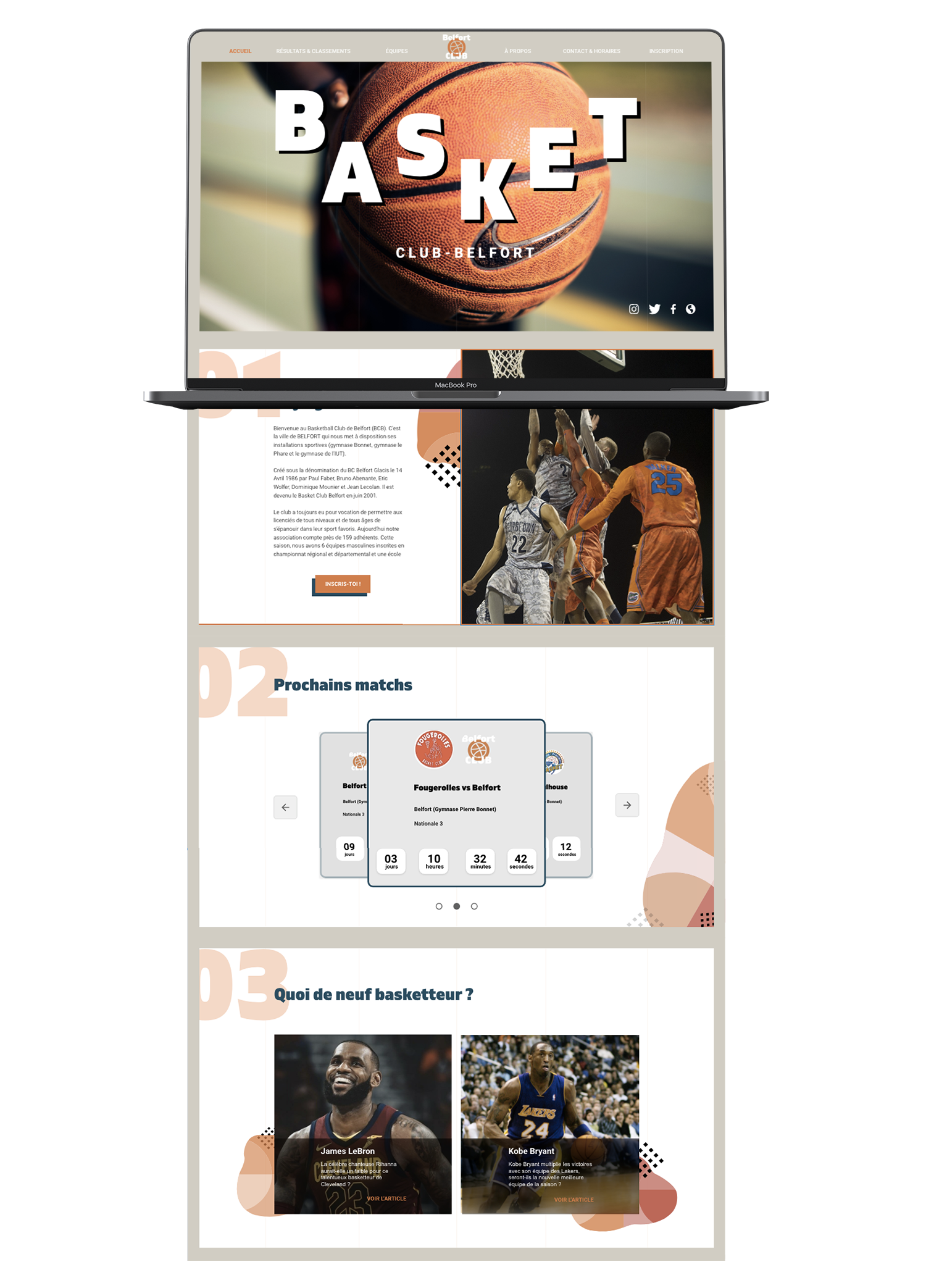
Eventually, with all of these last elements, I've done my graphical interface model. I decided to create animations on the title, sliders and buttons on XD in order to make it more attractive and interactive. In order to make it more colorful, I added some graphic elements which remind the basketball. Then, it stays consistent with this theme.
